MONO-KOTO
Wednesday, March 2, 2011
Bookmark of a book for Richard Hugo House (unreleased)
This was originally created as one of the series of fundraising campaign collaterals for Richard Hugo House. Richard Hugo House is a non profit organization and is a center for the literary arts that supports writers of all ages and backgrounds and promotes the creation of new writing.
久々の更新です。前回まで2回レタープレスの話題が続いたので、今回は少し離れてシアトルの無益団体へプレゼンしたデザインについて話してみようと思います。
このしおりは、シアトルの無益団体で、文学・作家希望の若者から大人までを応援するRichard Hugo Houseが、寄付金を募るための販促品の一部としてデザインしました。
This bookmark is one of the pieces that I designed when I worked at Golden Lasso a couple of years ago. For the literature lovers, bookmarks are always the "must item" to carry on your book. But it is so easy to lose it by getting it sink between the pages.
Hugo Houseは以前にGolden Lassoで働いていた時のクライアントで、しおりのデザインのコンセプトとしては、本好きが必ず持ち歩くものをデザインしよう、というもの。でも、普通のしおりはよく頁の間に埋まってしまうし、ただのしおりでは販促ツールとしての存在感に欠けますよね。
Then, I realized. What if it has the thing to stay above the book top, and what if that thing shaped like a book!? Yes, it's a book-shaped bookmark!
それを克服するため+本来の目的である販促品としてのアピール効果を考えて思いついたのが、ブック型のしおり。
Just like the logo for the Richard Hugo House, this book-shaped bookmark with a quote of Mr. Richard Hugo will always support you and encourage you as you read more books. Unfortunately, the grant we tried to get for them did not go through, so this project was ended un published but we do hope that someday we will make this happen.
Richard Hugo氏のQuoteをしおりbook見開きにかかげ、当局の方にもとても気に入ってもらったのですが、期待していた支援団体からの補助金交付が発行されなくなったため、保留となってしまいました。惜しかった。いつかの機会に是非実行したいプロジェクトの一つです。
Support Local!
Wednesday, September 1, 2010
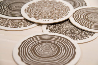
Letterpressed Coasters for Sale!
What a lucky person I am! To be able to work with Becky Mullins once again! This time, Becky and I produced 3 different coasters as our first collaboration.
First batch of these cards are made for Hey Marseilles, one of the Seattle's growing great Folk bands. I made these illustrtaions as a part of their merchandise I art-directed for. I did the illustration/design, and Becki did the printing at her letterpress shop in West Seattle. Every time I visit her, I learn so much about Letterpress from her and it has been a total pleasure to work with her!
幸運な事に、また活版印刷(レタープレス)スタジオ Myrtle Alley Press を経営するベッキーと仕事をするチャンスが有りました。今回は、二人のコラボレーションとして、2種類のコースターを制作。デザインの木の幹とフクロウ魚は私のイラスト、これはシアトルのフォークバンド Hey Marseillesのバンドグッズ用に作成したもので、今回バンドへのプレゼントとしてベッキーの印刷スタジオでコースターにしてみました。毎回ベッキーのスタジオにお邪魔するたびに、活版印刷の機械の歴史・操作・特徴などについて教えてもらえて、とても勉強になります。
The Theme is The Whimsical Northwest.


You can feel and see and enjoy the texture of the paper, embossing, custom mixed color of the coaster once you hold it in your hands. It'd dress up your tables in the theme of Northwest craft work!
紙の質感、活版印刷による凹凸、スペシャルオーダーした色調は手に取ってみると実感できます。ノースウェストのナチュラルな雰囲気がテーブルをドレスアップしてくれるでしょう。
Tree trunk and The Owl Fish, both of the coasters are available for purchase at Becki's website for 4 for $8.
コースターはベッキーのウェブサイトでペイパルを通して購入できます。もしくは、私に直接メールでご連絡ください。
They are all Finely Produced in Seattle, WA.
More stuff will come soon...!
今後も、もっとカードやその他グッズを制作販売していきますので乞うご期待!


Labels:
coasters,
hey marseilles,
letterpress,
myrtle alley press
Sunday, June 20, 2010
Letterpress
It was 4 years ago when I first really learned about letterpress at SCCC Creative Academy .
A little over 3 years since graduation, letterpress has always been a big part of my interest and passion. This crafty artisan operated, classical printing just excites me.
Through my previous work at Golden Lasso, I had the privilege of becoming friends with Rebecca Mullins, the artisan/proprietor of Myrtle Alley Press. She has a small letterpress print shop in West Seattle. This is pretty much the best place to be for me, and I am extremely excited to have the opportunity to become friends with her and will start our collaboration projects!
I have done a couple of letterpress projects at her shop while working at Golden Lasso. One of them is the business card for KOKO marketing.
The other one is a wedding invitation for a lady who works for our client company. She has a very specific color palette of baby blue, cherry pink, and charcoal grey. But 3 color print on letterpress is quite pricy. So we picked this beautiful fabric-ish baby blue paper, and printed 2 colors.


These are both made with Photopolymer plates on full-size Platen Job Press.
Letterpress printings tend to need more kerning between each letter. Especially, if you want to have greater impression of print. So, when you draw illustration, you need to watch out for the gaps between lines, as well as the amount of solid color space. Unlike the offset print, the font requires thicker weight, and it does look better with some weight on it.
Mmm....., there are still so much to learn!
Letterpress.
It is so classic. Therefore, it is so fresh in 2010.
Subscribe to:
Posts (Atom)


